YouTube Unveils Major Video Player Redesign for a "Cleaner, More Immersive" Experience
Notably, YouTube has begun rolling out a significant overhaul of its video player, promising a "cleaner and more immersive" viewing experience across all devices. The update, which started hitting users on October 15th, is expected to reach everyone globally by October 22nd, introducing a fresh aesthetic and several functional enhancements designed to obscure less content and generally make watching videos a bit more enjoyable. And, let's be honest, who doesn't want less clutter when they're trying to binge their favorite creators?
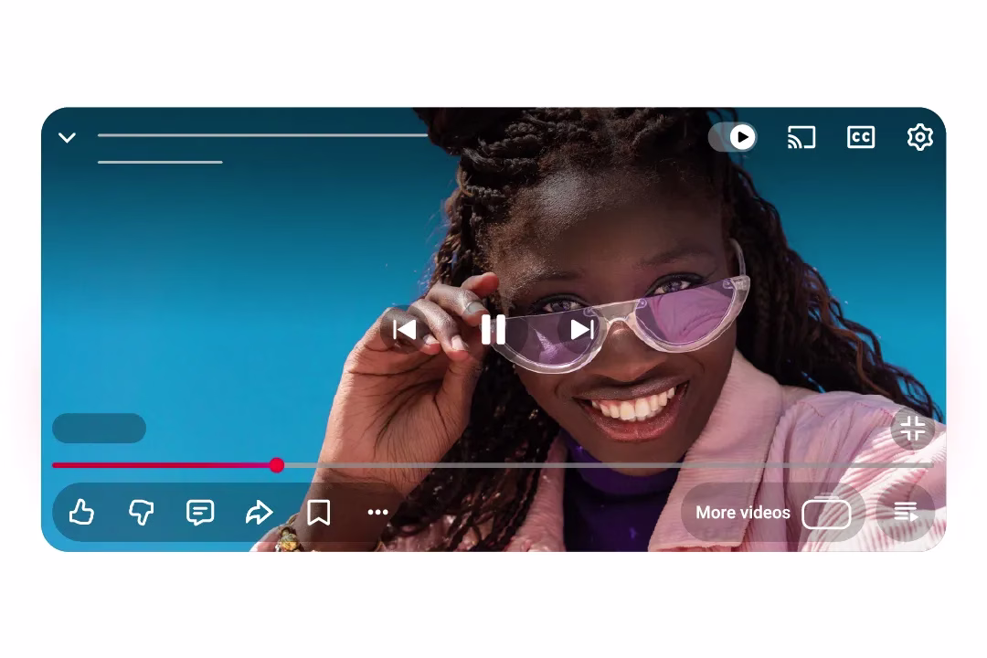
This isn't just a minor tweak; it's a comprehensive facelift. The most striking visual change is the redesigned on-screen controls. Gone are some of the more obtrusive elements, replaced by rounded buttons that feature a subtle translucency. It’s an effect that YouTube themselves describes as visually satisfying, aiming to blend the controls more seamlessly into the video content itself. Interestingly, while the translucency offers a modern touch, it's notably less intense than Apple's "Liquid Glass" effect we've seen on iOS 18, striking a balance that keeps readability in mind. This new look is universal, meaning you'll see it whether you're watching on your mobile phone, firing up YouTube on a web browser, or kicking back with the app on your smart TV.
Functional Enhancements Beyond the Visuals
But the update isn't merely skin-deep. YouTube's product teams have also been busy refining core interactions. Take the double-tap to skip feature, for instance. A staple for quickly jumping forward or backward in a video, this action is now described as "modern and less intrusive." Users often report that the previous animation could feel a bit clunky, visually interrupting the flow. This revised version aims for a smoother, quicker fade, reducing the visual interruption, however brief it may be. Small, but significant.
Perhaps one of the most anticipated improvements, especially for creators and engaged viewers, is the new "structured system for comment replies." We've all been there: diving into a lively comment section only to get lost in an endless, unthreaded scroll. This new system promises a more focused reading experience within the replies panel, making it easier to follow conversations and engage directly with specific comments. It’s a move that could genuinely enhance community interaction, making the comments section less of a chaotic free-for-all and more of a structured dialogue. And who wouldn't appreciate a little more order online?
Finally, there's a playful, dynamic animation for the like button that's rolling out to "some videos." Imagine hitting the like button on a music video and seeing a little music note appear, or perhaps a different animation for a cooking tutorial. It’s a subtle touch, but it adds a layer of interactivity and personality, making the simple act of liking a video a bit more engaging.
Riding the Wave of Minimalist Design
This overhaul places YouTube firmly within a broader industry trend towards cleaner, less cluttered interfaces. Companies like Netflix have made similar moves with their video players, recognizing that a minimalist design often translates to a more immersive and less distracting user experience. In an era where short-form video platforms like TikTok and Instagram Reels are vying for attention, reducing on-screen clutter can be a crucial factor in retaining viewer engagement. The company are hoping these changes will make long-form content feel even more premium.
While the initial reactions are largely positive, some users have pointed out that the translucency, while aesthetically pleasing, can sometimes make the controls slightly harder to discern against certain video backgrounds, especially in brightly lit environments. Others, accustomed to the old layout, are naturally undergoing a brief adjustment period. However, tech reviewers have largely lauded the update, with many calling it an "evolutionary" step that subtly but effectively enhances immersion without going overboard. It's a testament to YouTube's continuous effort to refine its platform, balancing visual appeal with functional efficiency.
What This Means for Your Viewing Experience
Ultimately, this update is about making YouTube feel more modern, more fluid, and less visually demanding. For viewers, it means less visual noise and a potentially more focused content consumption experience. For creators, especially those who thrive on community engagement, the improved comment system could foster richer interactions with their audience. This isn't just about pretty buttons; it's about optimizing the entire viewing ecosystem to keep pace with evolving user expectations and the competitive landscape of digital media. As the full rollout progresses over the next few days, it will be interesting to see how the broader community adapts to and utilizes these new features in their daily viewing habits. Will this subtle shift translate to a noticeable uptick in watch time? Time will tell, but it's certainly a step in a cleaner direction.