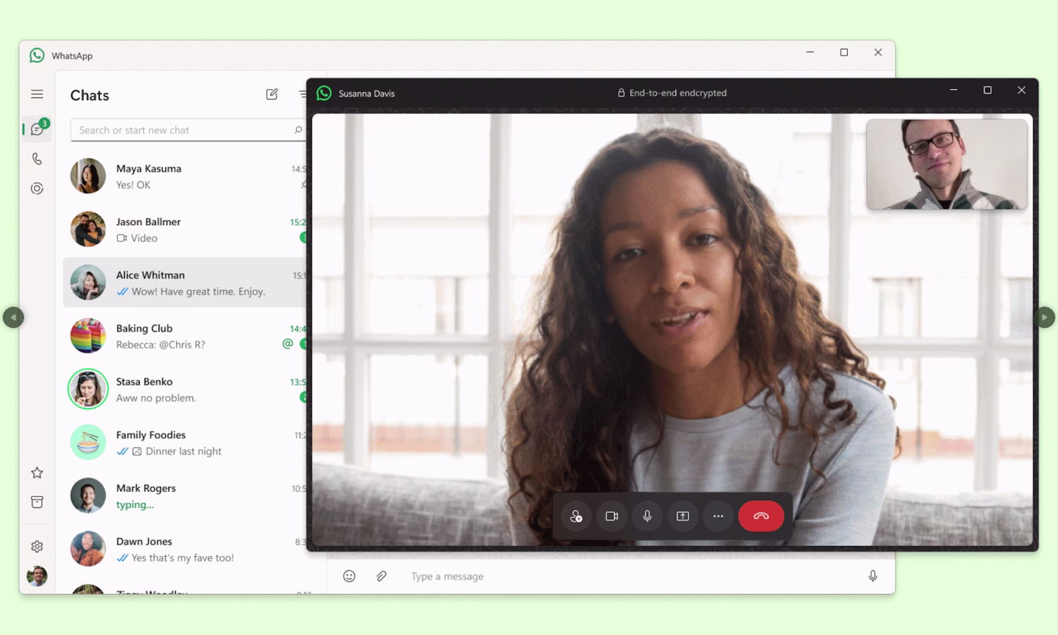
WhatsApp Embraces a Fresh Aesthetic: A Closer Look at the Platform's Visual Overhaul Meta's messaging giant, WhatsApp, is undergoing a significant visual transformation, rolling out a new look and feel across its various platforms. The redesign aims to modernize the user interface, enhance readability, and create a more consistent experience whether you're chatting on your phone, desktop, or the web . This comprehensive update touches upon colors, icons, spacing, and navigation, promising a more intuitive and focused user experience. A Unified Vision: Desktop and Web Clients Get a Makeover One of the most notable aspects of this refresh is the effort to bring a more cohesive design language to WhatsApp's desktop and web applications. For Windows users, the beta version of the app is showcasing a redesigned interface that takes cues from WhatsApp Web and incorporates elements familiar to macOS users . A key improvement is the enhanced accessibility of Channels, a feature that has been available on macOS for some time. Previously, Windows users often had to switch to their mobile devices to catch up on channel announcements and group activities. The new design integrates these more seamlessly, with Channels and Communities gaining greater prominence, often accessible from a sidebar section . This move is seen as a welcome step towards platform consistency, reducing friction for users who switch between devices . Similarly, the WhatsApp Web client has received a fresh interface. The redesign emphasizes improved aesthetic appeal and readability, introducing a cleaner look with darker colors that are easier on the eyes . The previous dark blue has been replaced with a much deeper hue . A previously hidden sidebar is now persistently visible, enhancing navigation. Users can more easily switch between sections like Chats, Status, Channels, Communities, Archive, and Starred Messages thanks to new, clearly defined buttons, allowing for effortless browsing . Mobile Refresh: Enhancements for Android and iOS The new look isn't confined to larger screens; mobile users on both Android and iOS are also seeing changes. Android users will notice updated icon designs, including new "squircle" icons, which aim to unify the aesthetics across Meta's family of apps . A significant navigational change for Android involves moving the main tabs (Chats, Status, Calls, Communities) from the top of the screen to the bottom. This shift is designed to make them easier to access, especially on larger phone screens . Furthermore, the search bar is now fixed at the top of the Chats tab for quicker access . Across both Android and iOS, WhatsApp has refined its visual elements : Color Scheme: The platform has introduced a new shade of green, aligning more closely with the official brand color. More significantly, WhatsApp is now using color more intentionally, aiming to draw focus to the most important elements on the screen rather than using color broadly . Dark Mode and Light Mode: Dark mode has been made "even darker" to improve text legibility and reduce eye strain. Conversely, light mode now features more white space, contributing to a cleaner and less cluttered appearance . Icons and Buttons: Many icons and buttons throughout the app have a new look, with changes to their shape and color to match the updated design language . Spacing: Users might notice that some parts of the app feel more spaced out, which can contribute to a less cramped and more organized feel . WhatsApp Logo: A subtle but noticeable change is the inclusion of the WhatsApp logo within the Chats tab . Core Principles: Readability, Accessibility, and Modernity The driving force behind these changes appears to be a multi-faceted approach to improving the user experience. The emphasis on darker dark modes and more intentional color use points directly to a desire to enhance readability and reduce visual fatigue . Navigational changes, such as the bottom tabs on Android and the persistent sidebars on desktop versions, are geared towards making the app easier and quicker to navigate . The updated icons and overall cleaner aesthetic suggest a push towards a more modern look, keeping WhatsApp visually competitive and aligned with contemporary design trends . Despite these widespread visual changes, WhatsApp has been careful to ensure that core functionalities remain untouched. Messaging, file sharing, and voice and video calls continue to work as users expect, ensuring a seamless transition in terms of usability . Gradual Rollout: Patience is Key It's important to note that these changes are being rolled out gradually . Some updates, like the Windows redesign, are initially appearing in beta versions . This phased approach allows WhatsApp to gather feedback, iron out any bugs, and ensure a smoother transition for its vast user base. So, if you haven't seen the new look on your device yet, it's likely on its way. The "new look" for WhatsApp signifies more than just a cosmetic touch-up. It represents a concerted effort to refine the user experience, promote consistency across platforms, and modernize the app's interface. While change can sometimes take getting used to, the focus on improved readability, easier navigation, and a cleaner design suggests that WhatsApp is aiming to make its ubiquitous messaging service even more user-friendly and visually appealing for the years to come.