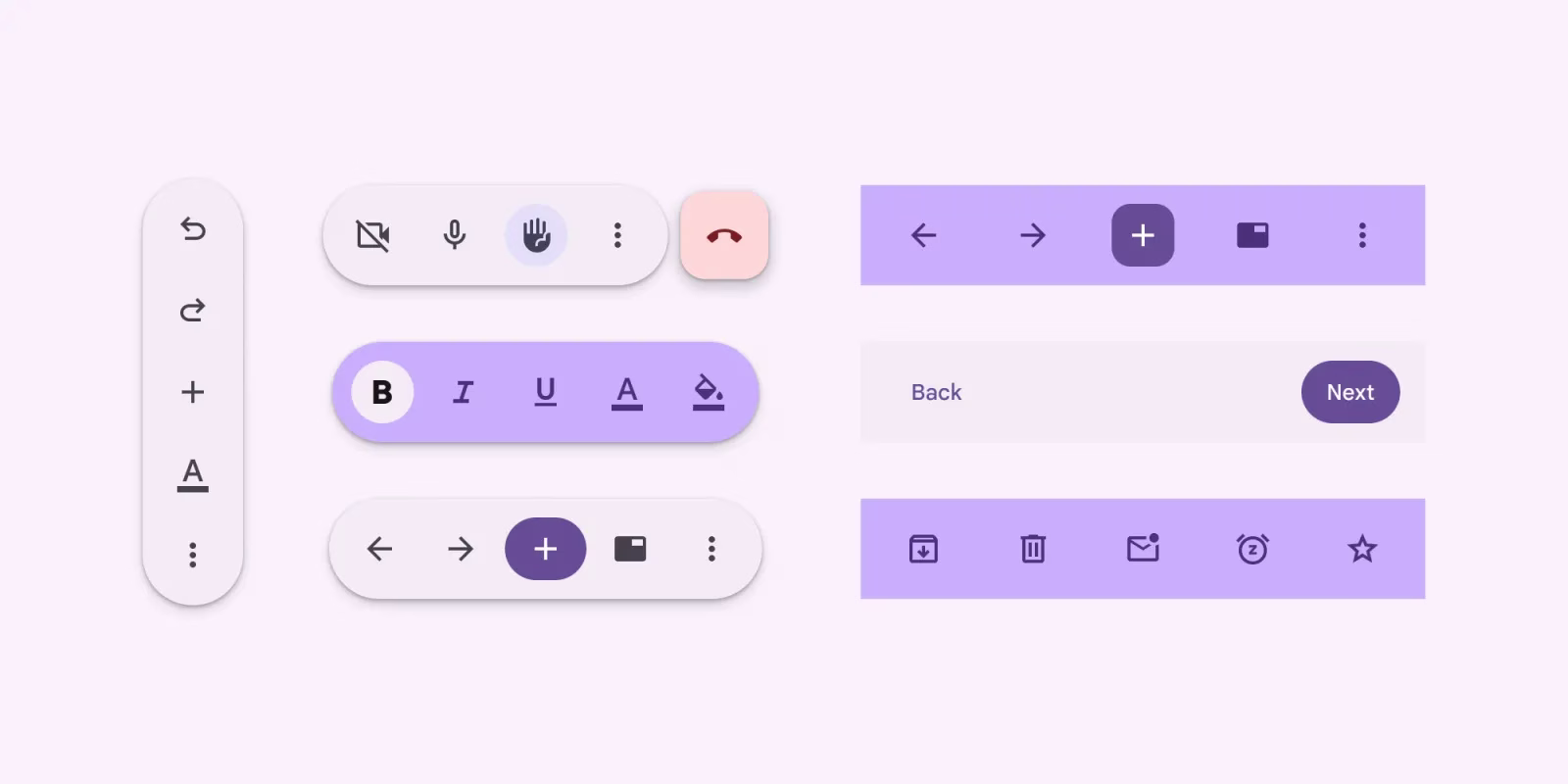
A New Bottom-Up Approach: Google's Material 3 Expressive and the Rise of Contextual Controls Let's talk about phone screens. They keep getting bigger, right? Great for watching videos or scrolling through endless feeds, but sometimes a real pain when you're trying to reach something at the top with just one hand. Google's been thinking about this, and their latest evolution of Material Design, dubbed Material 3 Expressive, seems to be doubling down on a solution: putting important stuff closer to your thumb. Specifically, they're making a significant push for bottom controls in apps that traditionally rely on top toolbars . This isn't just about moving existing buttons down. Oh no, there's a new kid on the block. Material 3 Expressive introduces a fresh component designed to live at the bottom of the screen. What does it do? It displays "frequently used actions relevant to the current page" . Think of it as a smart, contextual toolbar that pops up or sits subtly near where your fingers naturally rest. What Exactly Is This New Component? Google describes it as a "container with several" elements . That's a bit abstract, isn't it? But the core idea is powerful. Instead of a static toolbar fixed at the top, or even a floating action button (FAB) that's usually just one primary action, this new component is dynamic. It's meant to show you the actions you're most likely to need right now, based on what you're looking at or doing in the app. Imagine you're viewing a photo in a gallery app. A traditional top toolbar might have options like "Share," "Edit," "Delete," and maybe a menu for more. A FAB might just be "Edit." This new Material 3 Expressive component could potentially show you "Share," "Delete," and "Add to Album" all together at the bottom, because those are the things you frequently do with a single photo. If you then select multiple photos, the actions displayed would change to things like "Delete Selected," "Share Selected," or "Create Album with Selected." See how that relevance works? It's a floating toolbar, yes, but it's more than just floating. It's contextual. That's the key differentiator. It anticipates your needs based on the content you're interacting with . Why the Push for Bottom Controls? The rationale here is pretty straightforward, and honestly, it makes a lot of sense. As phones grow, the "thumb reach" area – the part of the screen you can comfortably interact with using one hand – shrinks relative to the total screen size. The bottom of the screen is prime real estate for thumbs. Putting frequently used actions there just improves ergonomics. It reduces the need for awkward stretches or, worse, using a second hand just to tap a button at the top. This isn't a completely novel idea, of course. Bottom navigation bars have been around for ages, helping you switch between main sections of an app. Floating Action Buttons (FABs) put a primary action within easy reach. But this new component seems to bridge the gap between a static navigation bar and a single-action FAB. It's a dynamic set of actions related to the content, not just navigation or one main task. Google's "push" suggests they aren't just offering this as an option; they're actively encouraging developers to adopt this pattern. They likely see it as a significant step forward in making apps more comfortable and efficient to use on modern devices. Potential Benefits and Hurdles On the user side, the benefits seem clear: easier access to tools, less hand gymnastics, and potentially a cleaner top toolbar since some actions might migrate down. It could lead to a more intuitive flow, where the actions you need appear almost magically near your thumb when you need them. But what about the developers? Implementing this requires a shift in thinking. They need to analyze user behavior and identify those "frequently used actions relevant to the current page" . They also need to design the UI to handle the dynamic nature of this component – what actions appear when, and how does the layout adjust? It's a standardization challenge, for sure, requiring updates to existing UIs to align with these new Material Design guidelines. There's also the potential for clutter. If not designed carefully, a dynamic bottom toolbar could become overwhelming, constantly changing and confusing users. What if the "frequently used" actions aren't the ones I use frequently? Or what if the component obscures important content? These are valid concerns that developers will need to navigate. It won't be a perfect fit for every single app out there, especially those that are heavily content-focused where screen real estate is paramount. Looking Ahead Material 3 Expressive, with its emphasis on these contextual bottom controls, feels like a natural evolution driven by the hardware we use every day. It's Google acknowledging the physical reality of large touchscreens and trying to make interaction more fluid. I think this push is a positive step. While there will undoubtedly be implementation challenges and design considerations, the core idea of putting relevant actions within easy reach is compelling. It could lead to a more comfortable and efficient app experience for millions of users. Will every app adopt it perfectly? Probably not. But seeing Google champion this pattern suggests we'll be seeing a lot more important buttons living closer to the bottom of our screens in the future. And frankly, my thumb is already thanking them.

