The End of an Era: Microsoft Retires the Iconic Blue Screen of Death After 40 Years
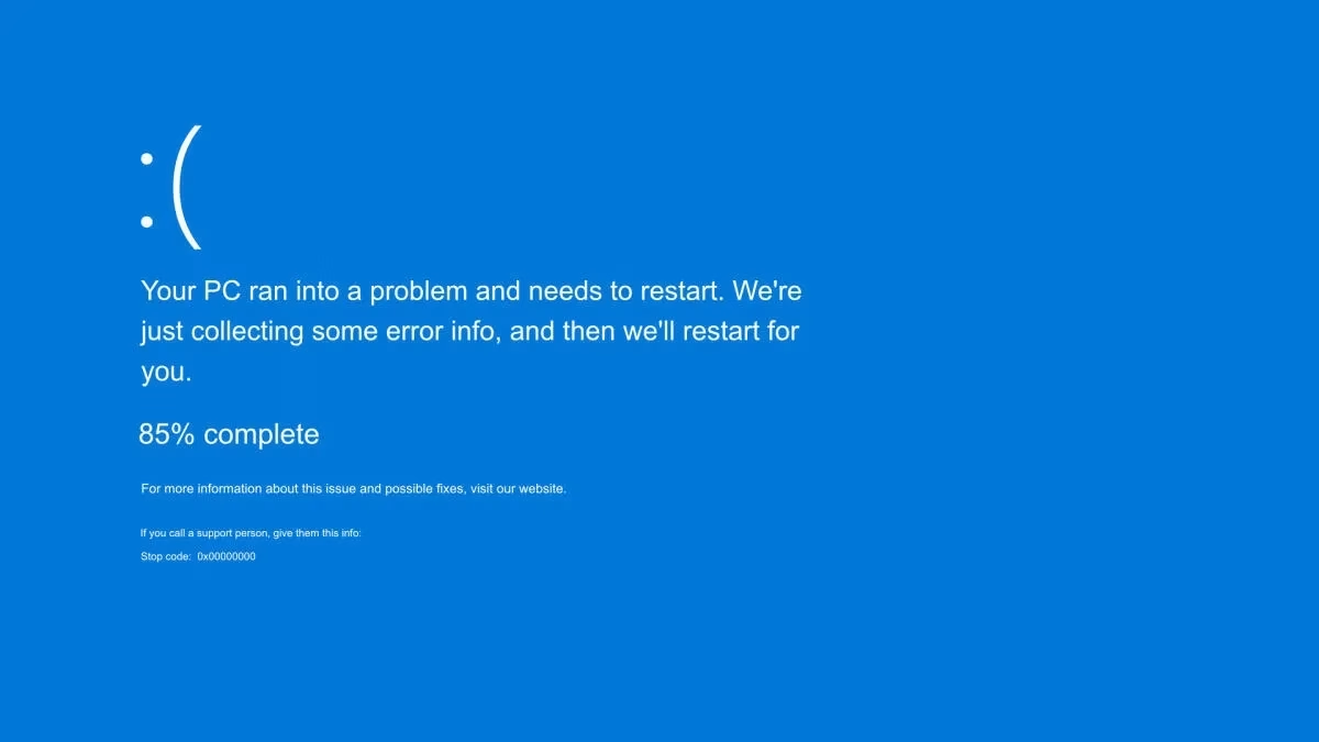
For four decades, it was a universally recognized symbol of digital despair: the Blue Screen of Death (BSOD). That stark blue backdrop, often accompanied by a cryptic error code and, in later iterations, a frowny-face, has haunted the dreams of PC users, system administrators, and anyone who's ever lost unsaved work. But as of June 26, 2025, Microsoft has officially pulled the plug on this notorious error screen, ushering in a new era of system crash notifications. It's a moment that, for many of us who've grown up with Windows, feels both long overdue and strangely nostalgic.
A Legacy of Frustration and Fascination
The BSOD, in its various forms, has been a fixture of Microsoft Windows since the early 1990s. From the early days of Windows 3.1 and NT, it served as the ultimate indicator that something had gone fundamentally wrong. A critical system error. A hardware conflict. A driver gone rogue. Whatever the cause, the blue screen was the final, undeniable proof that your machine had hit a wall. And often, it meant a hard reboot was your only recourse.
The Shift Towards a Gentler Error Experience
So, why the change now, after 40 years? It's not just about aesthetics, though the new "Black Screen of Death" certainly aligns with modern minimalist design trends. This move is a clear indication of Microsoft's ongoing commitment to refining the user experience and, crucially, enhancing system reliability.
Think about it: the BSOD, despite its infamy, was inherently jarring. It was an abrupt, full-screen interruption that screamed "catastrophe." In an age where user interfaces are designed to be intuitive, seamless, and less intrusive, a sudden blue takeover feels archaic. Microsoft's decision reflects a broader industry trend to prioritize user comfort and reduce the emotional impact of encountering system errors. They want to make these moments less startling, less like a digital heart attack.
The new black screen, while still signaling a critical issue, is reportedly designed to be less visually aggressive. It's a subtle but significant psychological shift. Instead of a bright, in-your-face blue, you get a darker, more subdued background. The information presented is still there, but the overall presentation is intended to be calmer, perhaps even encouraging a more rational approach to troubleshooting rather than immediate panic.
What Does the Black Screen of Death Mean for Users?
Functionally, the new Black Screen of Death (BSOD 2.0, if you will) will serve the same purpose as its predecessor: to inform users of a critical system failure that requires a restart. The key difference lies in its presentation. While details are still emerging, it's expected to maintain the essential information—error codes, QR codes for troubleshooting, and a brief explanation—but within a less alarming visual framework.
This change isn't just about making things look prettier; it's part of a larger push for improved system stability. We've seen significant strides in Windows' reliability over the years, but critical errors still happen. By making the error screen less intimidating, Microsoft hopes to foster greater user trust. It's a subtle nod to the idea that while things can go wrong, the system isn't completely falling apart. It's a controlled, albeit unfortunate, shutdown.
Community Reactions: Nostalgia Meets Relief
The news has certainly sparked a lively discussion across social media and tech forums. There's a palpable mix of nostalgia for the old blue screen—after all, it was a shared experience for generations of PC users—and a collective sigh of relief. Many are welcoming the change, seeing it as a sign of progress and a step towards a more refined operating system.
Tech analysts, too, are largely praising the move. They view it as a logical evolution in user interface design and a continuation of Microsoft's efforts to make Windows more robust and user-friendly. It's not a revolutionary feature, but it's an important symbolic one. It says, "We're listening. We understand that even error messages contribute to the overall user experience."
Looking Ahead: The Future of Error Handling
The retirement of the BSOD is more than just a cosmetic update; it signifies a broader trend in software development. Companies are increasingly focused on proactive error prevention and, when errors do occur, on providing clear, actionable, and less disruptive feedback. We're moving towards systems that are not only more stable but also more empathetic in their communication with users.
Will the Black Screen of Death become as iconic as its predecessor? Only time will tell. But for now, we can bid farewell to that familiar frowny-face and welcome a new, perhaps less anxiety-inducing, chapter in Windows' error handling history. It’s a small change, but sometimes, the small changes are the ones that truly mark the passage of time in the tech world. And honestly, my blood pressure might just thank them for it.
