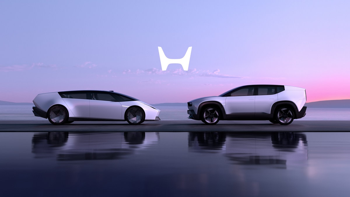
Honda’s New "H" Is a Hardware Reboot for the EV Age
Honda has officially stripped away the chrome. The Japanese automaker is currently rolling out a redesigned "H" mark, signaling what it calls a "second founding" as it attempts to claw back territory in an electric market dominated by Tesla and BYD. For the first time since 1981, the company is abandoning the boxed, 3D-effect logo that defined its internal combustion heyday. In its place is a thin, minimalist silhouette designed for a future where cars are defined by software rather than cylinders. The box is gone.
This shift is a calculated survival tactic. By ditching the heavy, metallic frame, Honda is signaling a break from its slow-moving hybrid transition and a pivot toward full-scale electrification. First teased on the Honda 0 Series concepts in 2024 and refined through prototypes shown just last week at CES 2025, this badge will define a new generation of vehicles. Production models are no longer a distant dream; they hit the streets in the first half of 2026.
A "Back to Basics" Approach to Modern Design
The new H badge is a radical pivot from the branding that has sat on Honda steering wheels for over four decades. By removing the outer border and flattening the lines, the company has created a visual that is both digital-friendly and a subtle nod to its 1963 roots. The top of the "H" now spans wider than the base, creating a wedge-like shape that Honda claims symbolizes "two outstretched hands."
There is a practical reason for this "thin" aesthetic. This logo mimics the flat design language of iOS or Android, making the car look less like a heavy industrial machine and more like a high-end mobile gadget. It’s also built for the hardware of tomorrow: the borderless design is easier to illuminate behind glass panels and integrates more seamlessly into the aerodynamic, sensor-heavy front ends of modern EVs.
Historically, Honda has been incredibly protective of its mark, with major redesigns occurring only in 1969, 1981, 1991, and 2001. This iteration is the most significant aesthetic gamble in the company’s history, underscoring the pressure to modernize or risk irrelevance.
The Digital-First Facelift
The rollout of the new mark extends beyond the grille. Honda is currently integrating the branding across its entire commercial ecosystem, from dealership signage to digital advertising and motorsports. While motorcycles will stick with their iconic Wing logo, the automotive wing of the business is using this badge to unify its electric and hybrid (e:HEV) products.
The transition will be a slow burn. Honda plans to launch 13 updated e:HEV hybrid models between 2027 and 2031, most of which will carry this new visual identity. However, legacy favorites like the current Civic and CR-V will keep the 1981-style emblem until they reach their next full generational overhaul. If you're buying a Prelude or a Super-One hatchback later this year, expect it to be among the final models to carry the old "boxed" look.
The H1 2026 Production Countdown
While the world saw the first illuminated versions of this logo in early 2024, the official production debut is now only months away. Honda has confirmed that the first vehicle to wear the badge in showrooms will be the 0 Series SUV, scheduled to begin production in Ohio during the first half of 2026. This will be followed rapidly by the 0 Series Saloon and the compact 0 Alpha SUV.
This timing is critical. Honda has recently moved away from its collaborative EV partnership with General Motors to focus on its proprietary "0 Series" platform. This independent streak is reflected in the new branding strategy, which includes a revamped "Honda" typeface first seen on the Prologue SUV. By reclaiming a design that echoes its 1960s origin while stripping away 20th-century bulk, Honda is trying to prove it can reinvent itself from the ground up rather than just following the pack.
