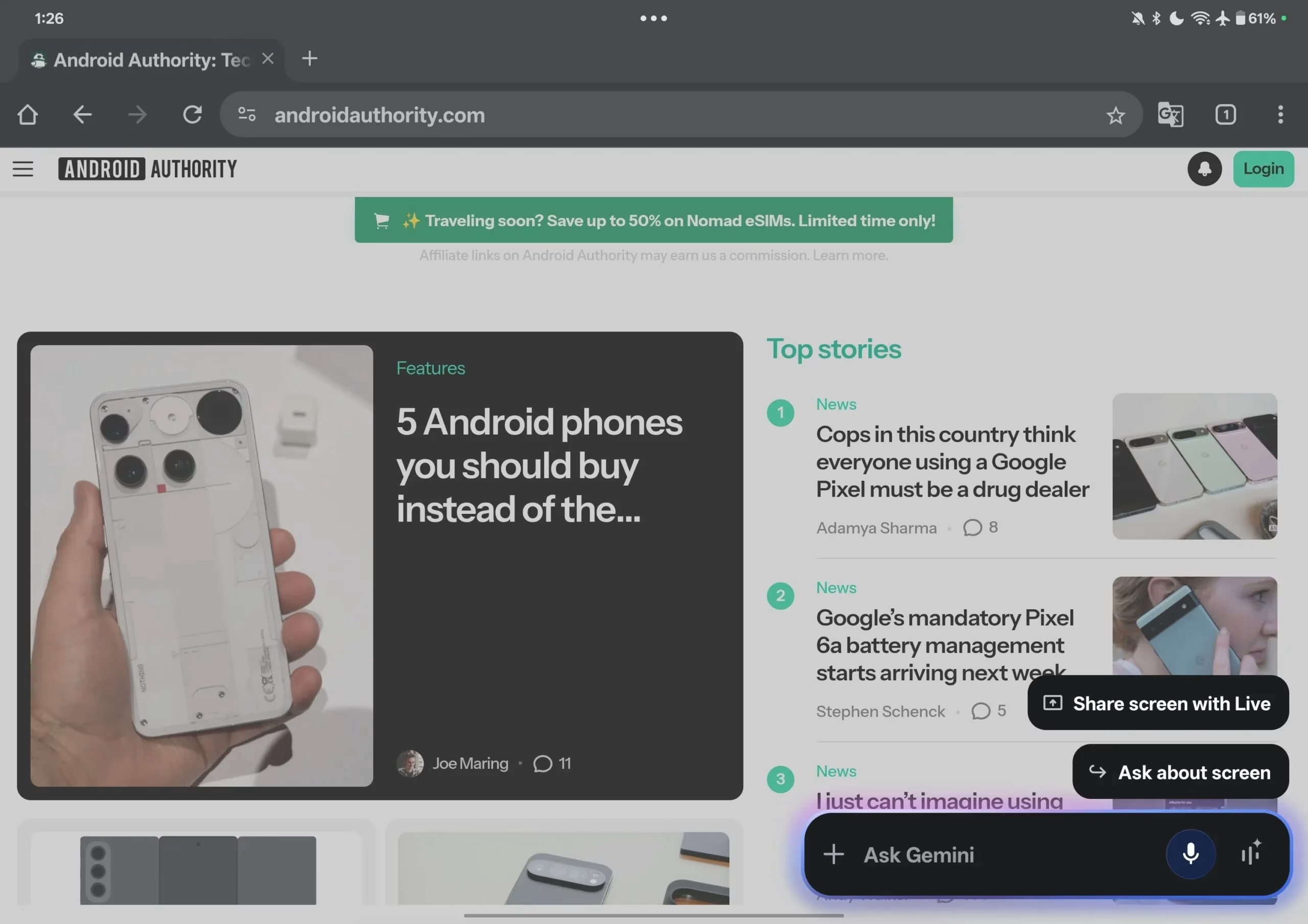
Google's Thoughtful Tablet Redesign: Gemini Gets a More Reachable Overlay
It's no secret that artificial intelligence, particularly in the form of conversational chatbots, has become an indispensable tool for many of us. I mean, who isn't using an AI assistant these days for everything from quick fact-checks to drafting emails? For me, Google Gemini is often the go-to, seamlessly integrated across my Android devices. But here’s the rub: designing for a phone is one thing, and designing for a tablet, with its expansive canvas, is quite another. Google, it seems, is acutely aware of this, and they're making some pretty smart moves to optimize Gemini for the larger screens of tablets and foldables.
The Ergonomic Shift: A Smaller, Smarter Gemini Overlay
The latest tweak to the Gemini app UI on Android tablets is a prime example of thoughtful design. Previously, when you invoked Gemini, its overlay would sprawl across a significant portion of your tablet's display, often taking up nearly two-thirds of the screen real estate. While functional, it could feel a bit... overwhelming. It certainly wasn't ideal if you were trying to reference something on the other side of the screen while interacting with the AI.
What's Changed, Exactly?
Google's new approach is all about efficiency and reachability. The Gemini overlay is now significantly narrower, occupying roughly one-third of the screen's width. That's a substantial reduction, isn't it? But it's not just about shrinking; it's about placement. The overlay is now anchored firmly to the right side of the screen. This seemingly small adjustment is a big win for ergonomics, especially for right-handed users. Think about it: most people hold tablets with both hands or support them with one, and having the primary interaction area closer to your dominant hand just makes sense.
Now, you might be wondering, "What about typing?" Good question! Google didn't just leave us hanging there. Tapping the text input box still intelligently shifts the overlay back to the center of the screen. This ensures you have ample space to see what you're typing without your hand or the on-screen keyboard obscuring the view. It’s a clever dance between compactness and usability.
An Ongoing Evolution: Google's Commitment to Tablet UX
This isn't Google's first rodeo when it comes to refining Gemini's tablet experience. We've seen a steady stream of UI updates aimed at making the AI more at home on larger screens. Not too long ago, the Gemini mobile app got a facelift, bringing its interface more in line with the web version. Part of that update included a navigation drawer that, crucially, is expanded by default on tablets but neatly collapsed on phones. These are the kinds of nuanced considerations that truly elevate a user experience from "just works" to "works beautifully."
The Rollout: Patience is a Virtue
As is often the case with Google's updates, this new Gemini overlay UI is part of a slow, server-side rollout. This means it's not hitting everyone's devices at once. So, if you're eagerly checking your tablet and don't see it yet, don't fret. You're not alone. From what I've gathered, only a handful of users, including the folks at Android Authority and a couple of early spotters on social media, have reported seeing it in action.
Now, while the right-anchored design is great for many, it does bring up a point for consideration: left-handed users. As of now, there doesn't appear to be an option to shift the overlay to the left side of the screen. It's a minor oversight perhaps, but one that could impact a significant portion of the user base. Hopefully, Google will consider adding a toggle for handedness in a future update. After all, inclusivity in design is paramount.
What's Next for Gemini on Larger Screens?
This particular update applies to the standard Gemini experience. But if you're a fan of Gemini Live, the more interactive, real-time variant, you might be wondering about its fate. Well, there's already evidence suggesting that Google is working on a more compact overlay for Gemini Live too. It stands to reason they'd want consistency across the board. It'll be interesting to see if that also gets the right-side anchoring or if they explore other layouts for Live's unique interaction model.
Ultimately, these continuous refinements underscore Google's commitment to making Gemini a truly versatile and user-friendly AI assistant across its diverse ecosystem of devices. The shift to a smaller, more reachable overlay on tablets isn't just a cosmetic change; it's a practical improvement that enhances usability and makes interacting with AI on larger screens a more natural, less cumbersome experience. And that, my friends, is a win for everyone.
